by
User Not Found
| Jun 10, 2016
Messenger is excited to add yet another great feature to Make It! Personal. The new Opacity Tool for images and design elements is simple to use, yet unleashes great potential for creative personalization! We’ve even expanded our Image Enhancement Tools to now work with our Design Elements**, not just photos!
*** Drop Shadow is not available for design elements, as it would not be stylistically appropriate.
1.) Let's find a panel in a design with a nice image to work with.
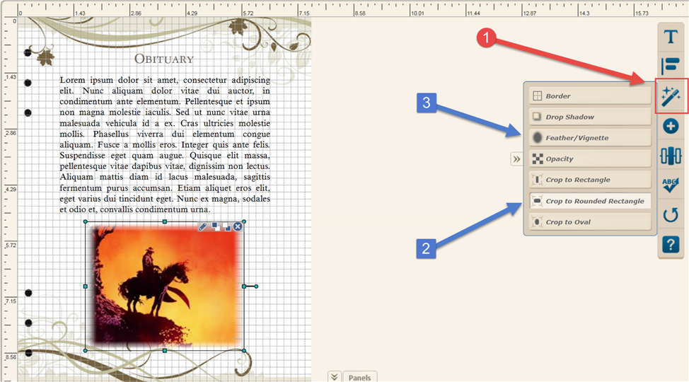
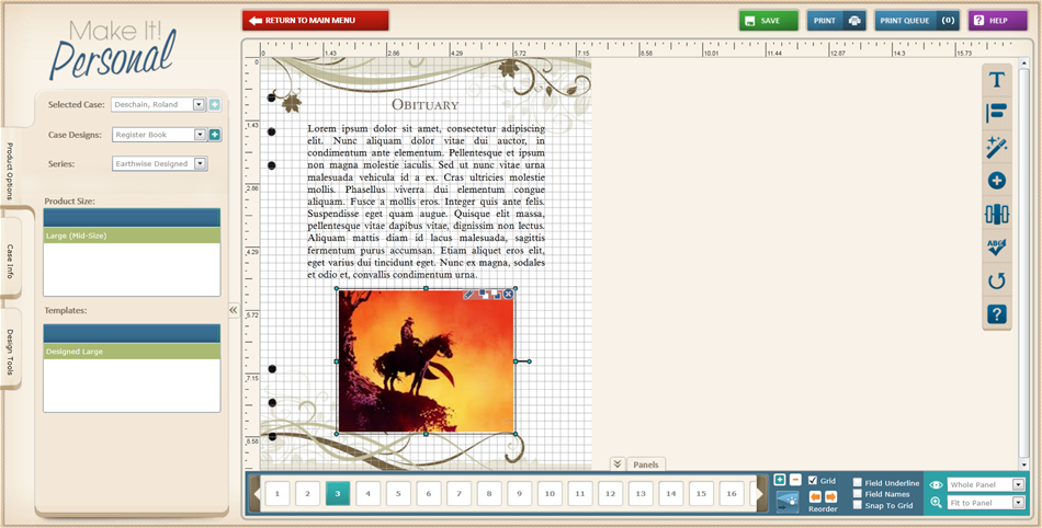 2.) Before we get into the Opacity Tool, I think the image could use a softer edge-- so with the image selected, I’ve clicked the Image Enhancement icon (magic wand) on the right hand toolbar. I used Crop to Rounded Rectangle, and then Feather/Vignette to achieve the gentler edge.
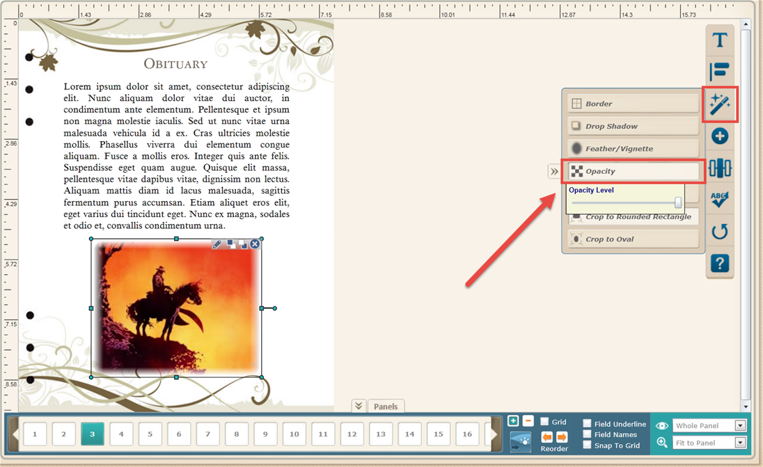
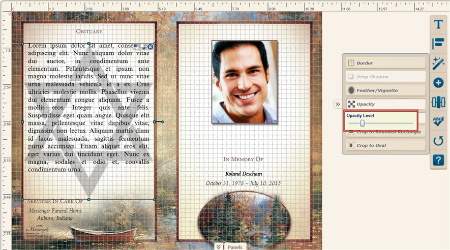
3.) Now, with the image still selected, we’ll go back again to Image Enhancements, and then click on Opacity. This brings up the Opacity Level slider control. With this we can adjust the transparency/opacity level of the image. As you can see, the slider is all the way to the right resulting in a 100% opaque image. As you slide the control to the left, the image becomes more transparent.
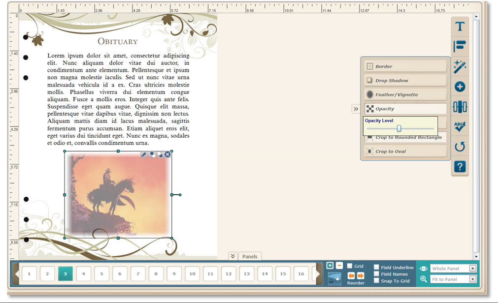
 4.) With the slider around 50%, the image is now considerable more transparent!
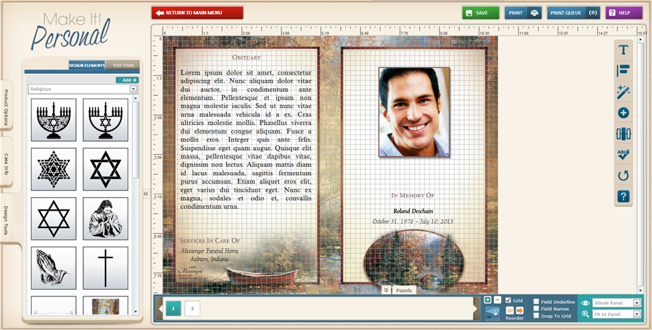
5.) We can get creative with our Opacity tool, including using semi-transparent images as a watermark. First we'll go to Design Tools > Design Elements and pick out an element.
6.) Here we've dropped an element onto the panel. Holding Shift while dragging, a resize point of the element will enlarge while maintaining its proportions.

7.) Once again, using the Opacity Level slider, we've reduced the transparently until we can easily read the text. When layering like this always keep in mind the readability of any text items.
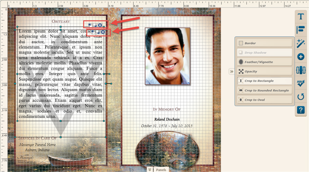
8.) Finally, we always want to be conscious of the concept of "layering" when dropping elements on a panel that completely or partially overlap. You can think of your design as having two "layers" that rest atop its background: a "Back" layer and a "Front" layer. The field controls (circled below) let us "send" a layer forward or back. You can hover your cursor over the small blue and white squares to indicate which control is Send to Front/Send to back. The best practice is to always have any text items in the front, while any semi-transparent/watermark type elements should go to the back layer.
With our web app’s already powerful editing and alignment features, the addition of these new Image Enhancement Tools allows you to unleash your creative potential, and lets you truly Make It! Personal!